Tuesday, 29 October 2013

My Google Mock Ups


These are my Google mock ups, I found them to be very basic and found that
it is quite hard to figure out and use Photoshop. Being a first time user I think I still have
A lot to learn. Each of my Google mock ups are basic yet each progress from one another.
I found that making a mistake on one allowed me to change and improve on my next.

Saturday, 26 October 2013

Genre Research:

Genre Research:

The genre I have chosen for my music magazine is Pop , Since I have chosen my genre I have decided to research my genre to allow me to understand what Pop consists of and the history behind it along with which artists fall into the category of Pop.

"Pop Music is a genre of popular music , which originated in the 1950’s .As A Genre , Pop music is very eclectic  (A style from a broad and diverse range of sources.) Pop often borrows styles from other music genre such as dance, urban and rock. Pop is generally  short-medium length songs, written in a basic form." - found on Wikipedia however reworded and cut down.

From this I found that Pop is a popular genre of music in which will help to boost the popularity of my magazine as it is about a popular type of music and has a large target audience.

Who is in the pop genre?

When researching on http://www.artistdirect.com/music/pop/877 I found that artists such as :

  1. Katy Perry
  2. Rihanna
  3. Miley Cyrus
  4. Bruno Mars
  5. Taylor Swift
  6. LMFAO
  7. Kanye West
  8. Justin Bieber
  9. PSY
  10. Jennifer Lopez
  11. Jessie J
  12. Carly Rae Jepsen
  13. Cher Lloyd
Are all part of the pop genre. The artists such as :

  1. Katy Perry
  2. Miley Cyrus
  3. Justin Bieber
  4. Jessie J 
  5. Jason derulo
Are all in the top 40 (charts) Showing the popularity of pop music.

Existing magazines within this genre is ;


  1. Vibe
  2. Billboard
  3. We <3 Pop
  4. Top of the Pops


Sunday, 20 October 2013

My Software;


The software I have decided to use for the production of my Music magazine are Adobe Photoshop and Microsoft Power-point word. I have decided to create the sections of my magazine on power-point as a draft layout and use this bases of them to then transfer onto Photoshop to edit and collaborate together into a front cover. When producing my magazine I will update on theory's I have tested using Photoshop in order to complete a final image.

Friday, 18 October 2013

My Task Check list For My music magazine

My Task Check list
For My music magazine


  1. Conventions of a music magazine
  2. Conventions of a double page spread
  3. Conventions of a contents page
  4. Reader profile
  5. Genre Research
  6. Google Front cover mock ups
  7. Genre Mood Board
  8. Examples of shots (photo shoot)
  9. Idea mood board relating to genre/Target audience
  10. Colour scheme
  11. Social class and Demographics
  12. focus group
  13. focus group response
  14. Liar anylasis 
  15. Intial Ideas Spider diagram
  16. Digital mock-up of front cover, double page spread and contents page.
  17. Any unused images
  18. Final front cover
  19. Evaluation


Monday, 14 October 2013

The Brief

My Brief is - To design a front cover , contents and double page spread of a new music magazine. All image and text must be original and a minimum of four images must be used.
I will blog my progress and will ensure to refer back to this brief throughout the course of this work.

Sunday, 13 October 2013

My Preliminary task Evaluation:


My Preliminary task Evaluation:
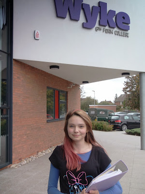
My preliminary task was to create a front cover of a new college magazine and a mock-up of a contents page and double page spread. Before creating my magazine I had to extract the different sections to magazines in which had already been created, Looking into the different conventions of a magazine, after looking at the conventions I then had to begin a L.I.I.A.R analysis for the front cover, contents page and a double page spread. To find my images I simply used the internet (google).While doing this research I found that a key success in creating a magazine, you must know your target audience this makes it easier to catch their eyes when you create your plugs or pull quotes, knowing their interests allows you to carefully select a set of stories and plugs which will intrigue them. I already know that my college magazine would be aimed at students at the age of 16-19, from this I decided to Research College magazines looking at what they used to target their audience also being 16 helped me to know what interests me and helped me when creating my mood board. After looking into the conventions and creating a mood board I then progressed onto creating an initial idea mind map, which allowed me to come up with a Masthead, I then continued onto creating a layout for my front cover and a mock-up of both my contents page and double page spread. I firstly drew up a draft of how I wanted it to look , I then progressed onto Photoshop creating a digital mock-up of each of my pieces (Front cover, Contents page and Double page spread) when doing this I made sure to refer back to my conventions ensuring to apply the needed ones to my magazine. While in the process of creating my contents page mock-up I came up with a list of what could be the contents, in which I decided to sit and choose the best / more intriguing ones to be the feature story’s upon my front cover these include “Results!” and “Jay’s talk on sport” however I decided not to initial put “Jay’s talk on sport” instead I decided to have him as a feature story but using “Jay scores Wyke the top spot once again” as this has a slight play on words with the “Jay scores” making the magazine a little more informal to make the readers feel comfortable also from this story I decide to create a pull quote as it makes the target audience want to read on about Jay the pull quote I decide on is “I enjoy playing so much I don’t mean to win I just do it” I believe this is a powerful pull quote as both my target audience along with the sporty people within my audience will be intrigued as to how he scores and wins without trying . After I had decided upon my feature stories I decided to begin taking my photos, with my stories in mind I took a set of various photo’s until I finally decided upon a clear shot of my subject stood in front of Wyke college, holding a folder, this targets my audience as it portrays the college life and shows the environment as well. I also referred to my brief in which I made sure my subject was in a medium close up shoot however my background doesn’t exactly back this as I would not have been able to contain the full image if I was to go any closer, also I ensured my subject was smiling this portrays she’s happy at Wyke however to ensure it doesn’t look like it’s all fun and the work is important I had her holding a folder. Since I had Wyke college in the background of my image, I decided my magazine name would not include ‘Wyke’ instead I referred back to my mind map and decided I liked ‘College Knowledge’ I think it has a rhyme to it and it catchy and easy to remember making my target audience more likely to remember it and be intrigued into “what is the college knowledge?”. To create my magazine I used the software’s, Photoshop, Microsoft PowerPoint. When using PowerPoint it allowed me to create my different conventions first in a simple form, in which I then transferred onto Photoshop to add detail and edited on to my background, Photoshop allowed me to remove objects I didn’t want within my image such as the alarm on the front of Wyke and the number plate on the car within the back ground.


Also Photoshop allowed me to layer my items ensuring that I could position things in separate places, overlap without effecting the other layers I had already created. During my progress I have been uploading my work to this blog (http://itsmymediayouknowit.blogspot.co.uk/ ) In which has helped me to keep onto of things and organize my work, Overall I am happy with what I have produced, I have found Photoshop to be the difficult part to the whole task and I have decided to try working on it with different images to help myself progress. After I had complete my front cover , I decided to post it upon Facebook an get some feedbackI found that most people liked my colour scheme (Green and purple) and my mast head "college knowledge caught peoples eyes" , Overall I received good feedback but an improvement for me would be my editing skills in order to make my magazine look more realistic along with text sizing.

Front Cover Feedback

After finishing my front cover I decided to post it upon Facebook an get some feedback I found that most people liked my colour scheme (Green and purple) and my mast head "college knowledge caught people’s eyes" , Overall I received good feedback but an improvement for me would be my editing skills in order to make my magazine look more realistic along with text sizing.


Final Front Cover


Any Unused Images

Here is all my unused images , each image I decided not to use because of on of the factors:
  1. Its not a medium close up
  2. It isn't focused enough
  3. It doesn't portray the right message
  4. Background doesn't contain the right environment


Software


The software I have decided to use for the production of my college magazine are Adobe Photoshop and Microsoft Power-point word. I have decided to create the sections of my magazine on power-point to then transfer them onto Photoshop to edit and collaborate together into a front cover. Also working with these software will help me to familiarise myself with them for my music magazine further into this course.


Saturday, 12 October 2013

My Preliminary Task Check list

My Preliminary Task Check list
For My College magazine

  1. Conventions analysis of a magazine front cover.
  2. LIIAR Analysis of a magazine front cover, contents and DPS
  3. Existing products research
  4. Examples of shot types
  5. Ideas mood board relating to genre/target audience
  6. Initial ideas spider diagram
  7. Digital mock-up of front cover (content & DPS)
  8. Any unused images
  9. Final front cover
  10.       Evaluation
I will re post this as I progress highlighting once I have completed my pieces.

Double page spread mock up

this is my simple mock up / template of how my double page spread layout would look.

My Contents Page Mock Up

Here is my contents page mock up , after researching and creating my mood board I decided to include various things a student might have an interest in,  into my contents page also I have included things such as Q&A (Questions and Answers) , Sports, Results and an opportunity to win something.

My Front cover mock up


Here is my Front cover mock up , I have planned out where I want things and will later add in detail and content to make my cover look realistic and to meet the magazine conventions.

Tuesday, 8 October 2013

My Front Cover Magazine Template (Preliminary task) 3

Before creating a mock of my college magazine I have decided to create a template/ a couple of templates of what my front cover might look like. third one : A neat pen mock template

My Front Cover Magazine Template (Preliminary task) 2

Before creating a mock of my college magazine I have decided to create a template/ a couple of templates of what my front cover might look like. Second one : A rough pen mock template.


My Front Cover Magazine Template (Preliminary task) 1

Before creating a mock of my college magazine I have decided to create a template/ a couple of templates of what my front cover might look like. First one : A computer mock template


Initial Ideas Mindmap


Initial Ideas:

Mast head: 
1.) Wyke Life
2.)College Knowledge
3.)What's @ Wyke

Target Audience:
1.) Students 
2.)Parents
3.) Teachers

Main Features/ Story Ideas:
1.)Results day
2.)Sports Competitions
3.)First Years
4.) Enrichments

Conventions:
1.) Barcode
2.) Masthead
3.) Feature stories
4.) Plug


Monday, 7 October 2013

My check-list - Progress

My Preliminary Task Check list
For My College magazine

  1. Conventions analysis of a magazine front cover.
  2. LIIAR Analysis of a magazine front cover, contents and DPS
  3. Existing products research
  4. Examples of shot types
  5. Ideas mood board relating to genre/target audience
  6. Initial ideas spider diagram
  7. Digital mock-up of front cover (content & DPS)
  8. Any unused images
  9. Final front cover
  10.       Evaluation
I will re post this as I progress highlighting once I have completed my pieces.

My Mood Board

When creating my mood board I considered my target audience of which is mainly college students, from this I created a list of things that might feature or are an interest to college students:
  1. Social networking (Facebook, Blogger, Twitter, YouTube.)
  2. Results 
  3. Fashion (Shoes, shops etc) 
  4. Fast food (Mc Donald's)
  5. Festivals & Hull fair
  6. Sports

From these I researched images and collaborated them into a mood board. I will use these to inspire my magazine later on.


Sunday, 6 October 2013

My Example Shots


Before creating my magazine I decided to create some example shots in order to establish
which one would suit my front cover overall when taking these images I decided to explain a little as to what the shots are and what they mean , I have found that a medium close up would allow myself to have my subjects surroundings to be established along with giving details of the subject.


Friday, 4 October 2013

L.I.I.A.R Analysis (What I have done)


Over the past week I have studied a Cosmopolitan magazine
In which I have done a L.I.I.A.R
analysis for a front cover , contents page and double page spread.
Looking at the :
Lanuage
Institution
Ideology
Audience
Representation
To show the meaning to their magazine also looking at the  Connotations
of spersifc parts of a magazine.

L.I.I.A.R Analysis Peer Feedback

During the production of my L.I.I.A.R Analysis I recieved peer feed back this is what was said.

Magazine Double Page Spread L.I.I.A.R Anylasis


Magazine Contents Page L.I.I.A.R Anylasis